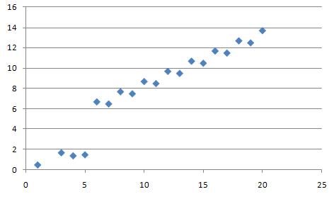
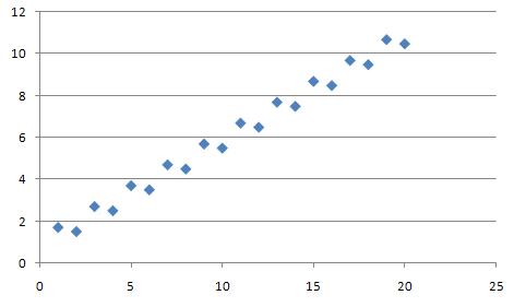
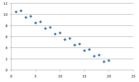
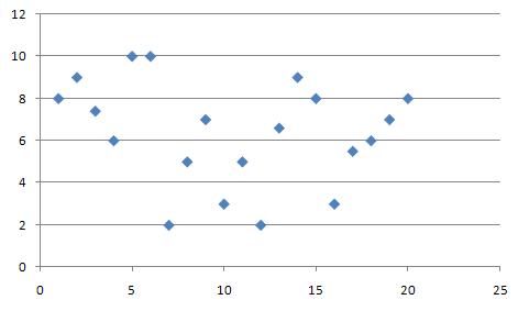
Scatter diagram
Scatter diagram is one of the tools that are used in the process of quality improvement. It is a graphical illustration of the view of the relations between the two variables. It should be used to examine the relationship between the two factors, e.g. investigate their cause and effect relationship.
Construction
Scatter diagram is created by marking empirical observations on a rectangular coordinate system. Each observation consists of two variables (X, Y) which can be shown as a point in a two-dimensional coordinate system. How the points are grouped together in the diagram shows the correlation between them. The simpliest case is linear correlation.
Correlation types
Positive correlation
In this case, each increase (decrease) of one variable is accompanied by increase (decrease) of the other. An example of a positive correlation may be the link between the planned number of days of hospitalization of the patient and the total cost estimates.
Negative correlation
In this case, each decrease (increase) of one variable is accompanied by increase (decrease) of the other. .
No correlation
In this case there is no visible correlation between variables.
Advantages and limitations of scatter diagram
A scatter diagram, also known as a scatter plot or scatter chart, is a graphical representation of two or more variables that shows the relationship between them. It is used to visualize the correlation between the variables, and to identify any patterns or outliers.
Advantages of a scatter diagram:
- It is simple to create and understand, making it a popular tool for data visualization.
- It allows for the identification of patterns or outliers in the data.
- It can be used to visualize the correlation between two or more variables, which can be helpful in identifying cause-and-effect relationships.
- It can be used to detect non-linear relationships between variables.
- It can be used to identify the direction, strength and form of the relationship between variables.
Limitations of a scatter diagram:
- It can be difficult to interpret when there are many data points on the graph.
- It does not provide information about the strength of the relationship between variables.
- It does not indicate causality, only correlation.
- Scatter plots can be misleading if the data points do not form a clear pattern.
- It only works well with two variables, so it is not useful when trying to examine the relationship between more than two variables.
In summary, scatter diagrams are a useful tool for visualizing the relationship between variables, but it is important to keep in mind their limitations when interpreting the results. It is always advisable to use other techniques and methods to validate the results obtained from scatter diagrams.
| Scatter diagram — recommended articles |
| Matrix diagram — 7 quality tools — Histogram — Analytical sheet — Pareto chart — Activity chart — Attribute control chart — Control chart — Multicollinearity |
References
- Montgomery, D. C., Runger, G. C., & Hubele, N. F. (2009). Engineering statistics. John Wiley & Sons.


