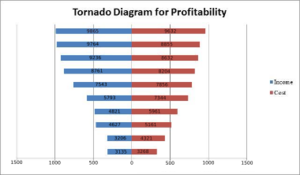
Tornado diagram
| Tornado diagram |
|---|
| See also |
Tornado diagram – it is one of the diagram types, which is used for deterministic sensitivity analysis.
The other well-known titles of this diagram type are tornado charts or tornado plots. The main use of this method is to show to the analyst which aspects are having more or less of influence on the decision she or she is interested to make (E. Bodmer, 2014, pp. 232-246).
What is sensitivity analysis?
Sensitivity analysis is a category in Math Statistic science concerned with influence which one (or more) various independent variables affect one particular dependent variable in specified system of assumptions.
In economics sensitivity analysis is used for simulation analysis. Another title of this category is “what – if” and it is mainly used by analysis to make a foresee result of a making decision including definite diapason of variables. Due to this, analyst can measure how changes in one variable affect the result (P. McNamee, J. Celona, 1987, p. 157).
Sensitivity Analysis contra Scenario Analysis
It is very important to mention that sensitivity analysis and scenario analysis are not the same methods as some might think. The foundations of sensitivity analysis are variables which influence estimation. This affect can be demonstrated on a financial model for example with using different prices. The sensitivity analyst separates those variables after what he or she can write down the diapason of probable results.
In opposition to that, scenario analysis identifies a definite scenario. For example, it might be crash on the stock market or changes in laws, which regulate industry. The scenario analyst changes the variables in the models, after what he or she can adjusts the model with that scenario. In the end, analyst knows the all spectrum of results, including all the extremity. Also, he or she is able to understand that the results are in specified system, which is characterized by real life scenarios ( D. Matheson, J. Matheson, J. E. Matheson, 1997, pp. 232-234.).
How does tornado diagram looks like?

How to build Tornado Diagram?
One of the main advantages of tornado diagram is that it is very easy to create. Moreover, you do not need any specific programs or computer softvare. Here you have 8 steps how to create tornado diagram in one of the general Microsoft programs – Excel:
- Put needed data into Excel table
- Convert the data in one of the columns to negative value (multiply that data with -1)
- Create a bar chart with data in the table (Insert Tab -> Charts -> Bar Chart)
- Open formatting options and change label position to “low” (Axis Option -> Labels -> Label Position)
- Modificate axis position in the reverse order (Axis Options -> Axis Position)
- Modificate series gap and gap width (Series Options -> Change Series Overlap)
- Modificate number formatting of the horizontal axis (Axis Option -> Number -> Select Custom and put ##0; ###0)
- Modificate the format of data labels for column with -1 (Label Options -> Number -> Select Custom and put ##0; ###0)
What does it mean "an appropriate tornado diagram"?
Appropriate tornado diagram is the diagram, which is showing a proper ranking of the value and decision sensitivity of a decision analysis with certain risk aspects. The proper ranking means that the analyst is not letting peculiarity of the model structure or our own preferences to blur the real important of the aspects.
Why it is so important to build an appropriate tornado diagram?
It is important to remember, that tornado diagram is one of the steps to make an excellence decision. This type of diagram shows the possible model of decisions to an analyst rather than the certain decisions as a topic of the analysis.
In addition to that, tornado diagram is an intuitive diagram, which usually is presented as an element of the final conclusion. However, knowledge about risk aspects, which are having the most influence, may be totally different from what analyst was expecting him or her to do.
For example, in some cases the top bar of the tornado diagram is unimportant to the final decision. it may be when the bar is creating big swings in the value, in spite of having same influence to all of the variants which are presented. Sensitivity analysis is using that sort of information in which companies are always interested the most to be able to make profitable decision. Due to that, decision sensitive aspects should not be ignored.
References
- Bodmer E. (2014). Corporate and project Finance modeling, Theory and Practice John Wiley & Sons Press, pp. 232-246.
- Matheson D., Matheson J., Matheson J. E., (1997). The Smart Organization: Creating Value Through Strategic R&D , Harvard Business School Press, pp. 232-234.
- McNamee P., Celona J., (1987). Decision Analysis for the professional with Supertree , Scientific Press, p. 157.
- Michael J. Conroy, James T. Peterson, (2013). Decision making in Natural Resource management: A Structured, Adaptive Approach, Wiley-Blackwell Press, p. 210.
Author: Olha Slyuzar