Box diagram
Box diagram (also box-and-whisker diagram, box plot) is a graphic method for depicting statistic data throughout quartiles (Lee 200, p. 106; Mosler 2006, p. 33). This kind of plot is useful in data analysis (Tukey 1977, p. 531). It is including information about the shape and dispersion of the empirical distribution. It is impossible to use it for nominal or grouped ordinal data (Hanneman 2012, p. 154).
Box diagram can be created by statistical programs as a specialized chart. This applies to data analysis - automatic generation of the box diagram provides information on the distribution of collected statistic data without the compulsion to calculate more indicators. The box diagram visualizes inter alia: quartiles, extreme values, and median (Day 2007, p. 437).
Construction
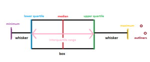
Box diagram includes (Wickham 2011, p. 2) :
- middle value called the median (Md) or second quartile (Q2):
- the number of intervals containing the second quantile,
- lower bound of the compartment containing the first quantile,
- cumulative number of the interval preceding the cumulative number of the first quartile,
- the span (width) of the compartment containing the first quartile,
- position of the first quartile,
- quartiles - lower (Q1) and upper (Q3):
- extreme values - minimum (L) and maximum (H),
- two whiskers combining extreme values with the box,
- outside-the-range values called also outliners.
Boxes are horizontal or vertical rectangles, left side of the box is defined by the first quartile (Q1), right side, analogically, is defined by the third quartile (Q3). The second quartile(Q2) also called median (Md) is depicting as a vertical line inside the box - it is the middle value of the data set (Welkowitz 2006).
Whiskers are the vertical lines that can be created in two ways. The first way to designate whiskers is by creating vertical lines extending from the minimum value (L) to the box and from the box to the maximum value (H) (Bay-Wiliams 2004, p. 90). The second way of designate whiskers is calculating a length of one and a half values of the interquartile range (IQR). In order to calculate the interquartile range, from aggregated by increasing values, you should find the value between lower 25% and upper 25% of the data (Vaughan 2001, p. 35). Outside-the-range values are depicted by points (DeVor 2007, p. 83). It is represented by the following equation:
- ,
- .
In case of having more than one box, the spaces between them are determined by dispersion degree and data skewness. Box diagrams are helpful in identifying outliners (McKenzie 2014, p. 44).
Examples of Box diagram
- A box diagram is a graphical representation of a system or process. It is typically used to illustrate the relationships between components, inputs and outputs, and other components of the system. For example, a box diagram may be used to illustrate the relationship between a bank's customer service department and its loan processing department. In this example, the customer service department would be the input and the loan processing department would be the output.
- Another example of a box diagram is a flow chart. A flow chart is used to diagram the steps in a process or system. For example, a flow chart may be used to diagram the process of taking out a mortgage loan. In this example, the steps would include obtaining a loan application, submitting the application for approval, and receiving the loan funds.
- Yet another example of a box diagram is a decision tree. A decision tree is used to illustrate the decision-making process. For example, a decision tree may be used to illustrate the steps a customer must take to choose the best credit card for their needs. In this example, the customer would need to consider the interest rate, annual fee, rewards program, and other factors before making their decision.
Advantages of Box diagram
Box diagrams are a useful visual tool for presenting data since they provide structure and clarity. They offer several advantages, including:
- Being relatively easy to create - Box diagrams are simple to construct, making them accessible to both novice and experienced data users.
- Allowing for quick comparison of items - Box diagrams are visually appealing and make it easy to compare different items side-by-side.
- Being highly versatile - Box diagrams can be used to represent a variety of data types, from numerical values to qualitative descriptors.
- Offering a variety of visual options - Box diagrams can be adjusted to help emphasize relationships between data points or to highlight certain items.
- Allowing for easy communication of results - Box diagrams can help make complex data easier to understand and communicate to a wider audience.
Limitations of Box diagram
Box diagrams, also known as box-and-whisker diagrams, are commonly used to show the distribution of a set of data. Though they are a useful tool for visualizing data, there are several limitations associated with them. These include:
- Limitations of data size: Box diagrams are limited to datasets of about 30 values or fewer, as including too many values can make it difficult to properly interpret the data.
- Inability to show outliers: Box diagrams can only show two types of outliers: mild and extreme. Since they cannot show all outliers, they may not provide an accurate representation of the data.
- Difficulty in interpreting data: Box diagrams are not the easiest diagrams to interpret, as the data has to be sorted and grouped into quartiles. This can make it difficult for the average viewer to understand the information.
- Limited to numerical data: Box diagrams cannot be used for non-numerical data, as the data must be sorted into quartiles in order to create the diagram.
In addition to Box diagram, there are several other approaches used to describe or visualize relationships between different elements of a system. These include:
- Flowchart: a graphical representation of a sequence of steps or operations to solve a problem.
- Decision tree: a diagram representing a decision process, used to identify a course of action.
- Venn diagram: a diagram that shows all the possible logical relationships between a set of variables.
- Fishbone diagram: a diagram used to analyze the root cause of a problem.
- Mind map: a diagram used to represent ideas, concepts and tasks in a visual format.
Overall, these approaches are useful for presenting complex information in an easy-to-understand visual format. They can be used to identify relationships between different elements of a system, as well as to identify the root cause of a problem.
| Box diagram — recommended articles |
| Parametric analysis — Decision tree — Descriptive statistics — Matrix diagram — Control chart — Attribute control chart — Three-Way ANOVA — Descriptive model — Histogram |
References
- Bay-Williams J.M., Martinie S.L. (2004). Math and Literature: Grades 6-8, Math Solution
- Day A.L. (2007). Financial Modelling in Microsoft Excel: A Practitioner's Guide to Applied Corporate Finance, Pearson Education
- DeVor R.E., Tsong-how C., Wiliam J.(2007). Statistical Quality Design and Control: Contemporary Concepts and Methods, Prentice Hall
- Hannman R.A, Kposowa A.J., Riddle M.D. (2012). Basic Statistics for Social Research, John Wiley & Sons
- Lee C.F., Lee A.C., Lee J.C. (2000). Statistics for Business and Financial Economics, Word Scientific
- McKenzie S. (2014). Vital statistics - An introduction to health science statistics, Elsevier Health Sciences
- Mosler K., Schmidt F. (2006). Descriptive and economic statistics, Sprong-Verlag
- Tukey J.W. (1977). Exploratory data analysis, Addison-Wesley
- Vaughan L. (2001). Statistical Methods for the Information Professional: A Practical, Painless Approach to Understanding, Using, and Interpreting Statistics, Information Today Inc.
- Welkowitz J., Cohen B.H., Ewen R.B. (2006). Introductory Statistics for the Behavioral Sciences, John Wiley & Sons
- Wickham H., Stryjewski L. (2011). 40 years of boxplots, Technical Report
Author: Dominika Paś


