Scatter diagram
| Scatter diagram |
|---|
| See also |
Scatter diagram is one of the tools that are used in the process of quality improvement. It is a graphical illustration of the view of the relations between the two variables. It should be used to examine the relationship between the two factors, e.g. investigate their cause and effect relationship.
Construction
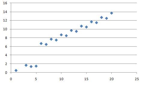
Scatter diagram is created by marking empirical observations on a rectangular coordinate system. Each observation consists of two variables (X, Y) which can be shown as a point in a two-dimensional coordinate system. How the points are grouped together in the diagram shows the correlation between them. The simpliest case is linear correlation.
Correlation types
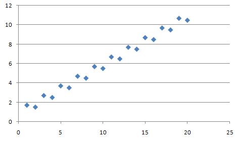
Positive correlation
In this case, each increase (decrease) of one variable is accompanied by increase (decrease) of the other. An example of a positive correlation may be the link between the planned number of days of hospitalization of the patient and the total cost estimates.
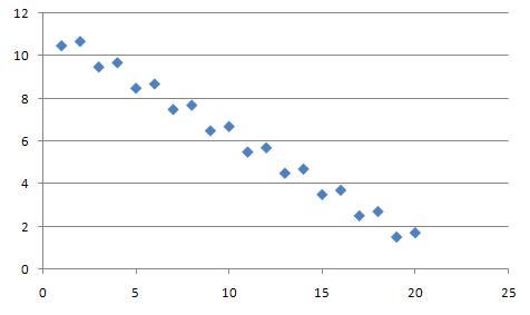
Negative correlation
In this case, each decrease (increase) of one variable is accompanied by increase (decrease) of the other. .
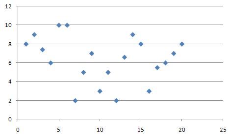
No correlation
In this case there is no visible correlation between variables.
References
- Montgomery, D. C., Runger, G. C., & Hubele, N. F. (2009). Engineering statistics. John Wiley & Sons.


