Box diagram
| Box diagram |
|---|
| See also |
| Box diagram |
|---|
| See also |
Box diagram (also box-and-whisker diagram, box plot) is a graphic method for depicting statistic data throughout quartiles (Lee 200, s. 106; Mosler 2006, s. 33). This kind of plot is useful in data analysis (Tukey 1977, s. 531). It is including information about the shape and dispersion of the empirical distribution. It is impossible to use it for nominal or grouped ordinal data (Hanneman 2012, s. 154).
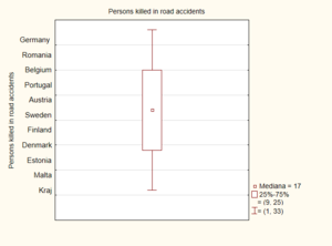
Box diagram can be created by statistical programs as a specialized chart. This applies to data analysis - automatic generation of the box diagram provides information on the distribution of collected statistic data without the compulsion to calculate more indicators. The box diagram visualizes inter alia: quartiles, extreme values, and median (Day 2007, s. 437).
Construction
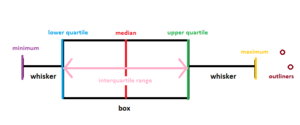
Box diagram includes (Wickham 2011, s.2) :
- middle value called the median (Md) or second quartile (Q2):
- the number of intervals containing the second quantile,
- lower bound of the compartment containing the first quantile,
- cumulative number of the interval preceding the cumulative number of the first quartile,
- the span (width) of the compartment containing the first quartile,
- position of the first quartile,
- quartiles - lower (Q1) and upper (Q3):
- extreme values - minimum (L) and maximum (H),
- two whiskers combining extreme values with the box,
- outside-the-range values called also outliners.
Boxes are horizontal or vertical rectangles, left side of the box is defined by the first quartile (Q1), right side, analogically, is defined by the third quartile (Q3). The second quartile(Q2) also called median (Md) is depicting as a vertical line inside the box - it is the middle value of the data set (Welkowitz 2006).
Whiskers are the vertical lines that can be created in two ways. The first way to designate whiskers is by creating vertical lines extending from the minimum value (L) to the box and from the box to the maximum value (H) (Bay-Wiliams 2004, s.90). The second way of designate whiskers is calculating a length of one and a half values of the interquartile range (IQR). In order to calculate the interquartile range, from aggregated by increasing values, you should find the value between lower 25% and upper 25% of the data (Vaughan 2001, s. 35). Outside-the-range values are depicted by points (DeVor 2007, s. 83). It is represented by the following equation:
- ,
- .
In case of having more than one box, the spaces between them are determined by dispersion degree and data skewness. Box diagrams are helpful in identifying outliners (McKenzie 2014, s.44).
References
- Bay-Williams J.M., Martinie S.L. (2004). Math and Literature: Grades 6-8, Math Solution
- Day A.L. (2007). Financial Modelling in Microsoft Excel: A Practitioner's Guide to Applied Corporate Finance, Pearson Education
- DeVor R.E., Tsong-how C., Wiliam J.(2007). Statistical Quality Design and Control: Contemporary Concepts and Methods, Prentice Hall
- Hannman R.A, Kposowa A.J., Riddle M.D. (2012). Basic Statistics for Social Research, John Wiley & Sons
- Lee C.F., Lee A.C., Lee J.C. (2000). Statistics for Business and Financial Economics, Word Scientific
- McKenzie S. (2014). Vital statistics - An introduction to health science statistics, Elsevier Health Sciences
- Mosler K., Schmidt F. (2006). Descriptive and economic statistics, Sprong-Verlag
- Tukey J.W. (1977). Exploratory data analysis, Addison-Wesley
- Vaughan L. (2001). Statistical Methods for the Information Professional: A Practical, Painless Approach to Understanding, Using, and Interpreting Statistics, Information Today Inc.
- Welkowitz J., Cohen B.H., Ewen R.B. (2006). Introductory Statistics for the Behavioral Sciences, John Wiley & Sons
- Wickham H., Stryjewski L. (2011). 40 years of boxplots, Technical Report
Author: Dominika Paś


