Pareto chart
Pareto chart is a tool that enables managers to find the most important causes of the problems. It is based on probability distribution that describes many phenomena in production, sociology, finance and other areas. See examples below.
The principle, on which chart is based was invented by marquis Vilfredo Federico Damaso Pareto, Italian engineer, economist and sociologist (at that time scientist in fact - distinction of disciplines came later).
The chart is sometimes named Pareto-Lorenz diagram. Max O. Lorenz was an American economist who developed Lorenz curve representing inequality of the wealth distribution. The curve was an example of 80-20 principle.
The chart modern look of the chart was proposed by Joseph M. Juran. The abscissa axis presents causes ordered by the number of occurrence, and the vertical axes: frequency (or cost) and cumulative percentage. The frequency of causes is shown as bars, and cumulative frequency as curve.
The Pareto chart is one of 7 quality tools together with: Fish diagram, Check sheet, Control charts, Histogram, Scatter diagram and Stratification.
Contents
- 1 Pareto 80-20 principle
- 2 Rules of Pareto analysis
- 3 Pareto diagram
- 4 How to make Pareto diagram
- 5 Examples of Pareto chart
- 6 Advantages of Pareto chart
- 7 Limitations of Pareto chart
- 8 Other approaches related to Pareto chart
- 9 References
Pareto 80-20 principle
The Pareto principle allows to find 20% of the causes generating 80% of the effects. It shows that the incidence of most types of events can be observed in only a small portion of possible circumstances. This is true in many areas, e.g.:
- 80% of sales is generated by 20% of the customers,
- 80% of the failures is due to 20% of the causes,
- 20% of the information determines 80% of the decisions.
- 20% of listed companies creates 80% all shares value on stock exchange.
Simplifying - a small number of people or the causes is responsible for the majority occurring phenomena. The abolition of the 20% of negative causes significantly improves the final result, a process, a situation. At the same time their identification allows to avoid the causes of minor importance, because Pareto principle is based on the analysis of the unequal distribution of decision-making factors.
Rules of Pareto analysis
The pareto analysis is a technique of using 80-20 principle to make the decision. The Pareto analysis is suitable to organize and analyse previously collected data. It is used when our goal is to prevent:
- Negative phenomena with the greatest frequency of occurrence.
- Phenomena creating biggest costs.
The decisions made in Pareto analysis are based on the items being analysed. Let's consider two examples:
Pareto analysis of problems causes
- The most influential 20% of causes are the most important ones. In case of problems causes they should be removed first.
- The following 30% of causes are the less important ones. They should be considered after removal of the first 20%.
- The last 50% of causes are the least important. Sometimes they disappear after removal of former causes. They might be important if the process is conducted under Six sigma program.
Pareto analysis of sales
- The most influential 20% of products are responsible for about 80% of profits. They are the most important and organization should focus on them.
- The following 30% of products are the "question marks". It is possible, that company can profit on them, but they require further analysis.
- The last 50% are the least profitable products. In most cases the company shouldn't invest in marketing of those products.
Pareto diagram

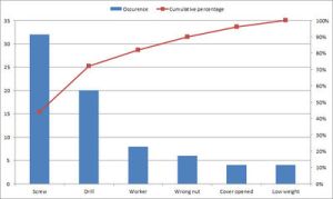
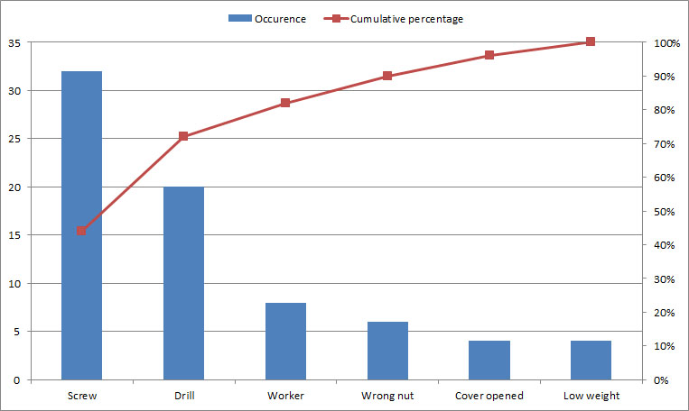
Example of Pareto chart
Pareto chart is a tool for the prioritization of the factors affecting the phenomenon studied. It is a graphical representation showing both relative and absolute distribution of types of errors, problems or their causes.
Description of the chart:
- Horizontal axis: causes, problems or items ordered by the number of occurrence
- Left vertical axis: frequency (or cost)
- Right vertical axis: cumulative percentage
- Bars: frequency of causes
- Curve: cumulative frequency
How to make Pareto diagram
Creation of a Pareto diagram requires:
- List of problems, causes or items to be compared
- Development of a standard measure for comparing the items
- Collecting data concerning occurrence or costs of those items
The chart should be created as follows:
- Sort the items in decreasing order of the measure of comparison (from the most frequen to the least frequent)
- Create a table with ordered causes and value of the measure (see below)
- Calculate sum of the values of the measure
- Calculate percentage (value of item / sum of values)
- Calculate cumulative percentage (in each row add all percentage values above and value of that row)
- Create a chart. On the left vertical axis show values, on the right - percentage
- On horizontal axis indicate items from highest to lowest
- Draw bars representing values of causes
- Draw line representing cumulative percentage
- Analyze the chart:
- choose about 20% of items that are responsible for about 80% of the phenomenon and decide what to do with them
- choose the next about 30% of items and decide whether they are important.
- probably you should ignore the rest (50% of items), as they have minimal impact.
Table 1. Example table containing data for Pareto chart
Causes
Occurrence
Percentage
Cumulative percentage
Screw
32
44
44
Drill
20
28
44+28 = 72
Worker
8
10
71+10 = 82
Wrong nut
6
8
90
Cover opened
4
6
96
Low weight
4
6
100
Examples of Pareto chart
- One example of the Pareto chart is when a company reviews customer complaints. The Pareto chart will provide a clear view of the types of complaints that are most common, allowing the company to prioritize how to address these complaints most effectively.
- Another example of the Pareto chart is when a company reviews its inventory of parts and supplies. The Pareto chart will provide a clear view of which items are most commonly used, allowing the company to decide which items to order in the highest quantity.
- A third example of the Pareto chart is when a company reviews its employee performance. The Pareto chart will provide a clear view of which employees are performing best and which areas need improvement, allowing the company to prioritize its efforts in training, development, and rewards.
Advantages of Pareto chart
Pareto chart is a powerful tool for managers to identify the most important causes of a problem. It has several advantages, including:
- It helps managers to prioritize tasks by identifying the most significant causes of the problem.
- It is based on the Pareto principle, which states that 80% of the effects are caused by 20% of the causes. This makes it easy to identify the most important causes and focus on them.
- It is easy to understand and interpret, as it uses bar or line graphs to present the data.
- It can be used to track the progress of the solution to the problem, as the chart can be updated as the problem is being solved.
- It can be used to find trends in data, which can help inform decisions about how to address the problem.
Limitations of Pareto chart
Pareto charts are useful tools for identifying the most important factors that contribute to a problem, but there are several limitations that should be taken into consideration when using them. These limitations include:
- Pareto charts are only useful for identifying the relative importance of different factors; they do not provide a way to quantify the exact impact of each factor.
- Pareto charts are unable to identify subtle interactions between factors, which can have a significant impact on outcomes.
- Pareto charts can only be used to analyze data that is collected in a consistent way and is of a high quality; if the data is incomplete or inconsistent, the results of the analysis will be unreliable.
- Pareto charts do not take into account external factors that may influence the outcome, such as external market conditions or changes in customer demand.
- Pareto charts can be misleading if the data is not presented in the correct context; for example, a factor that appears to be important in one context may be of less importance in another.
Pareto chart is a tool that can be used to determine the most important causes of a problem. However, there are other approaches that can be used to identify the causes of problems and make decisions. These include:
- Root cause analysis - This approach uses a systematic method to identify the causes of a problem by looking at the entire system and tracing the cause of the problem.
- Failure mode and effects analysis (FMEA) - This approach uses a structured process to identify the potential causes of a problem and prioritize the corrective actions that need to be taken.
- Ishikawa diagram - Also known as the Fishbone Diagram, this six-step approach uses diagrams to identify the potential causes of a problem.
- Scatter diagrams - This approach uses a graphical representation of two data points to identify correlations and relationships between them.
In summary, Pareto chart is a powerful tool to identify the most important causes of a problem, but there are several other approaches to identify the causes and make decisions.
| Pareto chart — recommended articles |
| Control chart — P chart — Spaghetti diagram — Attribute control chart — Central tendency error — Analytical sheet — Np chart — Quality loss function — Qualitative risk analysis |
References
- Statistics behind Pareto distribution (Wikipedia)
- Karuppusami G., Gandhinathan R., (2006) Pareto analysis of critical success factors of total quality management: A literature review and analysis, The TQM Magazine, Vol. 18 Iss: 4, p. 372-385
- Wilkinson L. (2006), Revising the Pareto Chart, The American Statistician, 60(4)
Author: Slawomir Wawak

