Control chart
| Control chart |
|---|
| See also |
The control chart is the basic and oldest tool for statistical process control. The creator of control charts is Walter A. Shewhart, who presented them in his book in 1924. Control charts are graphical method for monitoring, in which the main role is played by properly organized panoramic diagram. This diagram minimizes the number of required numerical operations, while following the course of the controlled process. Control charts are used to control variability and its causes. They are in the form of sheets that are so designed that operator can easily indicate changes of analysed parameter.
Every company strives to manufacture its products profitable. For this purpose, it must control the processes so as to meet all the requirements. It does so precisely using control charts. Using it employees can easily tell whether the change observed at any given time is a random event or is caused by errors of staff, machines or managers. If the latter, the next step is to find and eliminate the real cause of problem in process. Such a signal is presented in a control card in the form of:
- points beyond the control lines,
- the specific sequences of consecutive points.
In summary control charts are aimed at checking whether the process takes place as planned. However, in the long run they help to assess the stability of the process.
Types of charts
X bar R chart ()
The chart was the first widely used control chart. It is based on average value (the center line) and range. The mathematics is easier, but the results are less precise. Therefore, it should be used on samples lower than 10-.
X bar S chart ()
The chart is based on standard deviation, which gives more precise results than in case of range. Range takes into account only the lowest and highest values, while standard deviation takes all. It should be preferred chart for normal usage.
C chart
Type of control chart to monitor count-type data, e.g. total number of nonconformities. It requires a fixed sample size. It is possible to track defects by type or using other category.
U chart
Type of control chart to monitor count-type data, like C chart. But in this case, the number of units may vary. Sometimes it is convenient to increase sample size if the number of defects is low.
Other types of charts
- Shewhart individuals control chart
- Three-way chart
- P chart
- NP chart
- Expotentially weighted moving average chart (EWMA)
- Cumulative sum of quality characteristics chart (CUSUM)
Construction
Control charts are created at specified intervals of the manufacturing process, using the predetermined number of samples. Information is coded in sheets, which allow to check whether the process is stable. On horizontal axis samples are marked, while on the vertical - the value of the observed variable. When creating control charts following steps apply:
- choice of the feature that will be investigated,
- choice of type of chart,
- store data for the calculation,
- designation of the center line,
- defining upper and lower control line.
Choice of control chart type
Nowadays there are a lot of types of control charts, however it is convenient to begin with simple ones: R and S chart. The R chart is based on average and range, while S chart on average and standard deviation. In 1924, when the chart was created, counting standard deviation was very time consuming, therefore R chart was popular. Today we rather use S chart because of greater accuracy. The other criterion is sample size. If the sample size is smaller than 10- you should use R chart, otherwise S chart.
Let's assume that x is a variable we analyse using control chart. Then
where:
- n - number of parts in sample
- i - next sample
- x bar - average value of x
Designation of the center line
The center line is .
Defining UCL and LCL - upper and lower limits
Upper and lower limits are based on and ± 3s.
In many cases it is convenient to draw additional alert lines at ± 1.5s (half-way to limit) or 1s (1/3 of limit).
Drawing control chart
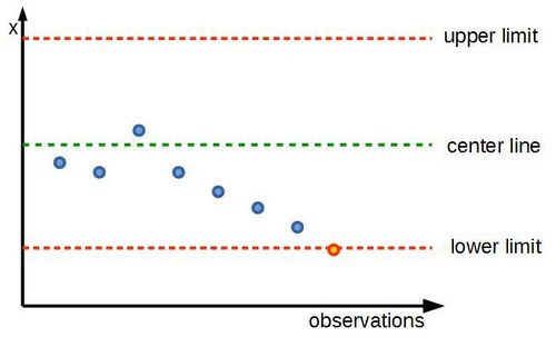
On the chart center line and limits were drawn. Next quality inspector draws observations (blue points). In this example after several items, something went wrong and variable x crossed lower control line. That is clear signal of problems.
Interpretation of control chart
There are several rules of interpretation of control charts:
- points beyond control line - cause of the problems should be identified and definitely removed from the process.
- points beyond alert line - two consecutive points beyond alert line are signal that something goes wrong - don't wait for crossing limit.
- points on only one side of center line - four consecutive points on one side of center line may indicate that process requires recalibration.
- mixture - points are beyond lower and upper alert lines (zigzag) - process is out of control.
- rule of seven - seven consecutive points showing tendency (e.g. each latter point is lower than former) - process gets out of hand.
References
- Examples of interpretation of control charts
- Adamska M., Leksykon zarządzania, Difin, Warszawa 2004
- Lock. D., Podręcznik zarządzania jakością, Wydawnictwo Naukowe PWN, Warszawa 2002


