Pareto chart
| Pareto chart |
|---|
| See also |
Pareto chart is a tool that enables managers to find the most important causes of the problems. It is based on probability distribution that describes many phenomena in production, sociology, finance and other areas. See examples below.
The principle, on which chart is based was invented by marquis Vilfredo Federico Damaso Pareto, Italian engineer, economist and sociologist (at that time scientist in fact - distinction of disciplines came later).
The chart is sometimes named Pareto-Lorenz diagram. Max O. Lorenz was an American economist who developed Lorenz curve representing inequality of the wealth distribution. The curve was an example of 80-20 principle.
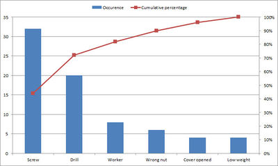
The chart modern look of the chart was proposed by Joseph M. Juran. The abscissa axis presents causes ordered by the number of occurrence, and the vertical axes: frequency (or cost) and cumulative percentage. The frequency of causes is shown as bars, and cumulative frequency as curve.
The Pareto chart is one of 7 quality tools together with: Fish diagram, Check sheet, Control charts, Histogram, Scatter diagram and Stratification.
Pareto 80-20 principle
The Pareto principle allows to find 20% of the causes generating 80% of the effects. It shows that the incidence of most types of events can be observed in only a small portion of possible circumstances. This is true in many areas, e.g.:
- 80% of sales is generated by 20% of the customers,
- 80% of the failures is due to 20% of the causes,
- 20% of the information determines 80% of the decisions.
- 20% of listed companies creates 80% all shares value on stock exchange.
Simplifying - a small number of people or the causes is responsible for the majority occurring phenomena. The abolition of the 20% of negative causes significantly improves the final result, a process, a situation. At the same time their identification allows to avoid the causes of minor importance, because Pareto principle is based on the analysis of the unequal distribution of decision-making factors.
Rules of Pareto analysis
The pareto analysis is a technique of using 80-20 principle to make the decision. The Pareto analysis is suitable to organize and analyse previously collected data. It is used when our goal is to prevent:
- Negative phenomena with the greatest frequency of occurrence.
- Phenomena creating biggest costs.
The decisions made in Pareto analysis are based on the items being analysed. Let's consider two examples:
Pareto analysis of problems causes
- The most influential 20% of causes are the most important ones. In case of problems causes they should be removed first.
- The following 30% of causes are the less important ones. They should be considered after removal of the first 20%.
- The last 50% of causes are the least important. Sometimes they disappear after removal of former causes. They might be important if the process is conducted under Six sigma program.
Pareto analysis of sales
- The most influential 20% of products are responsible for about 80% of profits. They are the most important and organization should focus on them.
- The following 30% of products are the "question marks". It is possible, that company can profit on them, but they require further analysis.
- The last 50% are the least profitable products. In most cases the company shouldn't invest in marketing of those products.
Pareto diagram
Pareto chart is a tool for the prioritization of the factors affecting the phenomenon studied. It is a graphical representation showing both relative and absolute distribution of types of errors, problems or their causes.
Description of the chart:
- Horizontal axis: causes, problems or items ordered by the number of occurrence
- Left vertical axis: frequency (or cost)
- Right vertical axis: cumulative percentage
- Bars: frequency of causes
- Curve: cumulative frequency
How to make Pareto diagram
Creation of a Pareto diagram requires:
- List of problems, causes or items to be compared
- Development of a standard measure for comparing the items
- Collecting data concerning occurrence or costs of those items
The chart should be created as follows:
- Sort the items in decreasing order of the measure of comparison (from the most frequen to the least frequent)
- Create a table with ordered causes and value of the measure (see below)
- Calculate sum of the values of the measure
- Calculate percentage (value of item / sum of values)
- Calculate cumulative percentage (in each row add all percentage values above and value of that row)
- Create a chart. On the left vertical axis show values, on the right - percentage
- On horizontal axis indicate items from highest to lowest
- Draw bars representing values of causes
- Draw line representing cumulative percentage
- Analyze the chart:
- choose about 20% of items that are responsible for about 80% of the phenomenon and decide what to do with them
- choose the next about 30% of items and decide whether they are important.
- probably you should ignore the rest (50% of items), as they have minimal impact.
Table 1. Example table containing data for Pareto chart
| Causes | Occurrence | Percentage | Cumulative percentage |
|---|---|---|---|
| Screw | 32 | 44 | 44 |
| Drill | 20 | 28 | 44+28 = 72 |
| Worker | 8 | 10 | 71+10 = 82 |
| Wrong nut | 6 | 8 | 90 |
| Cover opened | 4 | 6 | 96 |
| Low weight | 4 | 6 | 100 |
References
- Statistics behind Pareto distribution (Wikipedia)
- Karuppusami G., Gandhinathan R., (2006) Pareto analysis of critical success factors of total quality management: A literature review and analysis, The TQM Magazine, Vol. 18 Iss: 4, p. 372 - 385
- Wilkinson L. (2006), Revising the Pareto Chart, The American Statistician, 60(4)
Author: Slawomir Wawak
